You’ve invested in your medical spa. You’re services are on point, you’ve hired experienced providers, and maybe you’re even getting steady website traffic. But bookings? They’re inconsistent. Some weeks feel great. Others are quiet and you’re left wondering what’s going on.
Here’s the truth many med spa owners don’t realize right away: your website might be the problem.
Not because of the aesthetics. Not because it’s broken. But because your med spa website design isn’t guiding visitors toward one clear action of booking an appointment.
The good news? You don’t always need a full redesign to fix this. In many cases, a few smart design improvements can instantly increase bookings. This article breaks down exactly what to fix, why it matters, and how to turn your website into a reliable booking engine.

Why Med Spa Website Design Directly Impacts Bookings
Med spa websites have a unique job. They must feel welcoming, professional, and trustworthy, all within seconds.
Most visitors arrive with questions like:
- “Is this treatment right for me?”
- “Is this place legitimate?”
- “How do I book an appointment?”
If your medical spa website design doesn’t answer those questions quickly, visitors leave, even if they were interested.
Modern patients are impatient and browsing from their phone.
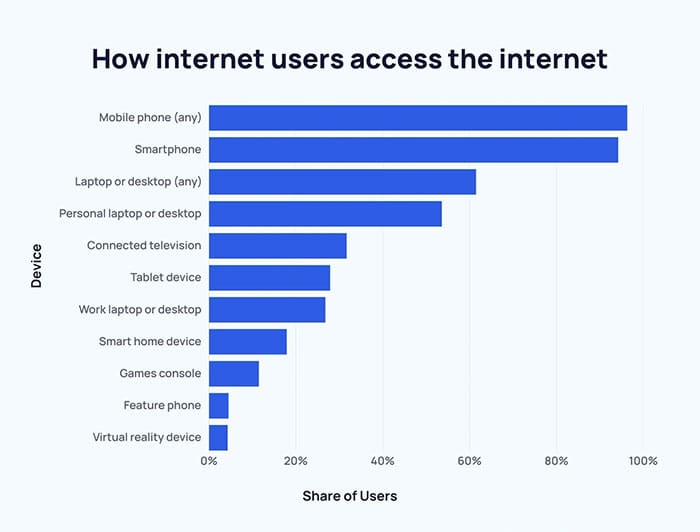
Exploding Topics reports that 96.3% of internet users go online using a mobile phone.

In 2025, nearly 96% of internet users access the web on mobile, compared to 62% on desktop or laptop.
This means most people are researching health and wellness services on the go. And they expect those experiences to be quick and effortless.
Your website isn’t just branding anymore. It’s part of your sales process.
The Most Common Med Spa Website Design Problems We See
After reviewing dozens of med spa websites, the same issues come up again and again:
- The site looks beautiful but doesn’t guide action
- Booking buttons are hidden, inconsistent, or confusing
- Navigation menus are overloaded with too many options
- Service pages explain treatments but don’t explain benefits or recovery details
- Mobile experiences feel cramped or frustrating
These aren’t technical problems, they’re design problems. And they quietly cost you bookings every single day.
Fix #1: Make Booking the Primary Action on Every Page
If visitors have to search for how to book, you’re losing them.
High-converting med spa website design makes booking obvious and easy:
- A clear “Book Now” or “Schedule Consultation” button in the header
- The same CTA language used across the site
- Buttons placed throughout long pages, not just at the bottom
- Sticky booking buttons on mobile

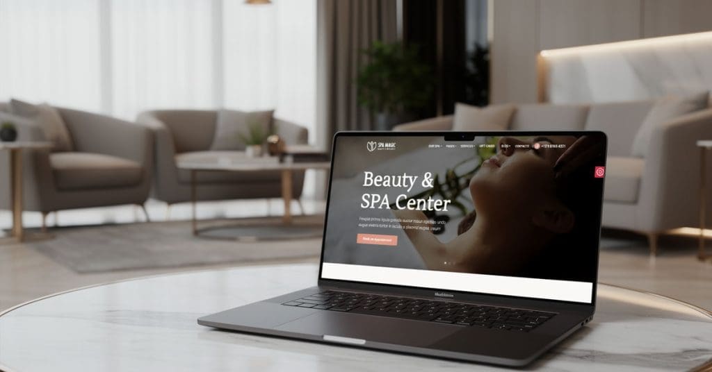
Example of placing a call-to-action button in a med spa web design header making it easy for visitors to book from any page.
Fewer clicks mean fewer chances for people to change their mind.
Fix #2: Design Your Homepage for First-Time Visitors
Most people landing on your site have never been there before. Your homepage should be built for them, not returning patients.
Within the first few seconds, your homepage should answer:
- What services you offer?
- Who are they for?
- Why should visitors trust you?
- What’s are the next steps?
Strong med spa web design uses:
- Clear, simple heading messaging
- Scannable sections (not long paragraphs)
- Visual hierarchy that guides the eye
- Images or video
If your homepage feels cluttered or unclear, small design fixes may help. But if the structure itself is confusing or outdated, a redesign may be the smarter move.
Fix #3: Turn Service Pages Into Decision-Making Pages
One of the biggest mistakes we see is service pages that read like medical textbooks.
Visitors don’t need every technical detail right away. They need help deciding if the treatment is right for them.
High-performing med spa service pages include:
- Who the treatment is best for
- The main benefits (in plain language)
- What results to expect
- How long is the recovery time
- What happens next (consultation or booking)
Each service page should have one clear CTA. Not six. Not seven. One.
For example, if a visitor is reading about injectable treatments, the call-to-action should be just as specific.
Instead of a generic “Contact Us,” a clear CTA like “Schedule Your Botox Appointment” makes the next step obvious and removes hesitation.
Fix #4: Build Trust Through Design — Not Just Content
Trust is critical in medical aesthetics, and design plays a huge role.
Effective med spa website design builds confidence through:
- Real provider photos and short bios
- Before-and-after galleries placed thoughtfully (not loaded with photos)
- Real reviews placed near booking buttons
Online reviews play a major role in how patients choose a med spa.
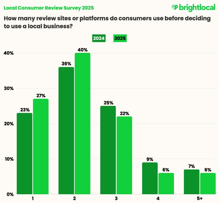
BrightLocal’s 2025 Local Consumer Review Survey shows that 40% of consumers check at least two different review sites before making a decision.

More consumers are comparing reviews across multiple sites than in previous years.
When trust elements are placed at the right moments in the user journey, visitors feel safer taking the next step.
Fix #5: Optimize for Mobile Bookings First
Most med spa browsing happens on phones. If your mobile experience is frustrating, conversions drop fast.
Common mobile design issues:
- Buttons that are too small
- Long, complicated forms
- Slow page load times
Speed matters more than most med spa owners realize.
While the industry benchmark for page load time is around 2 seconds, the average website still loads slower. Especially on mobile.
When pages take too long to load, visitors don’t wait. 53% of mobile users will leave if a site takes over three seconds to load.
Page speed optimization is often the fastest way to improve bookings without a full redesign.
When a Med Spa Website Redesign Makes More Sense
Sometimes, small fixes aren’t enough.
A redesign may be the better option if:
- Your platform is outdated
- Your site structure is confusing
- Branding and design feel inconsistent
- It’s difficult for you or your team to update
Instead of guessing, a proper audit helps you decide whether to optimize or rebuild.
How to Tell If Your Website Is Costing You Bookings
Ask yourself:
- Can someone book in under three clicks?
- Is the main CTA visible without scrolling?
- Does mobile load quickly? Not when connected to the office WiFi.
If the answer is “no” to any of these, your med spa website design is likely holding you back.
Final Thoughts: Clarity Converts
Your website doesn’t need to be flashy. It needs to be clear.
When med spa website design focuses on trust and simplicity, bookings follow naturally.
Small changes can create big results.
Especially when they’re guided by real user behavior.
How Can Neur Digital Help?
At Neur Digital, we specialize in med spa website design that blends design strategy and conversion.
Whether your site needs targeted improvements or a full redesign, we start with clarity, not guesswork.
Claim your free med spa website design strategy session and get clear, actionable insights to increase bookings without pressure.


